I've ditched my RSS reader for WebSite-Watcher from Aignesberger Software. It's not the first time. I've used the program on-and-off for years. It just seems to me it's better to have something to monitor anything with than be restricted to the usual limited RSS reader offerings.
You see, WebSite-Watcher can keep up with just about everything.
X, Facebook, Instagram, RSS, eBay, regular web pages, it's all there. If you find something you can't put into the program then you may be doing something wrong. For example, record a macro for X in order to keep up with X.
You know, stuff like that.
Bottom line, there's nothing I've thrown at WebSite-Watcher it hasn't been able to work with, and that's quite amazing. For roughly half the price of Feedly, what are you waiting for?
EDIT
Yes, so WebSite-Watcher does not monitor email boxes. I completely forgot about that. I can see how such a thing would be extremely beneficial to users, in order to allow them to track alerts.
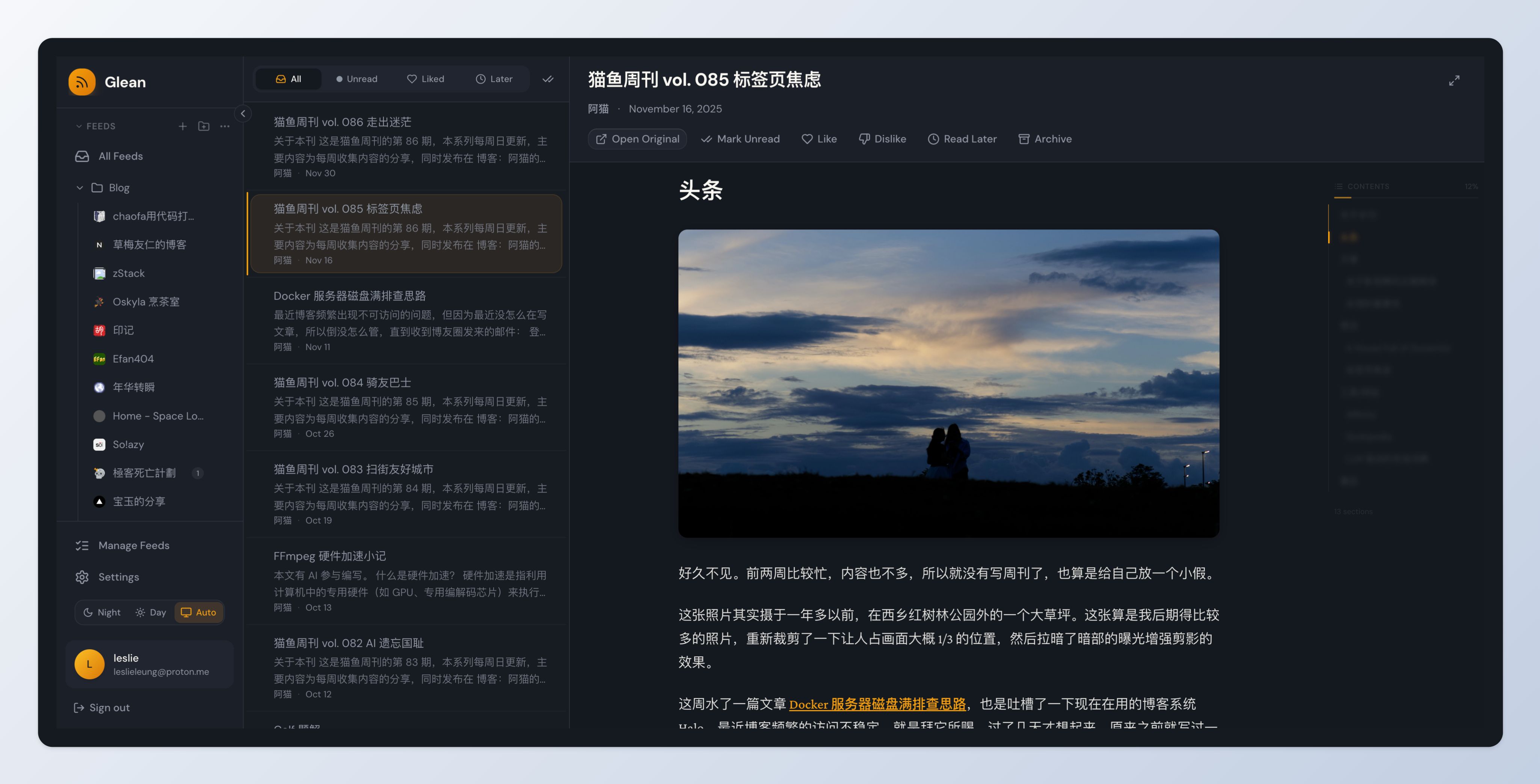
So I installed Glean, a self‑hosted feed reader, and I think it has the best approach to handling Read Later items I’ve seen yet. There’s an auto‑cleanup option that removes entries after 1 day, 7 days, or 30 days. You can also set items to never expire if that’s what you prefer. Additionally, the remaining time you have to read each entry is displayed right in the Read Later list.
Connect your favorite platforms, discover supported sites, or turn any public page into a stable RSS feed you can use in the reader or automation tool you prefer.
No X, Instagram, Facebook or other social-media account is required: create feeds from public content without signing in to those platforms.
Available are Free, Starter, Pro, and Power plans. The $11.99 EUR Pro plan gives you 50 feeds!
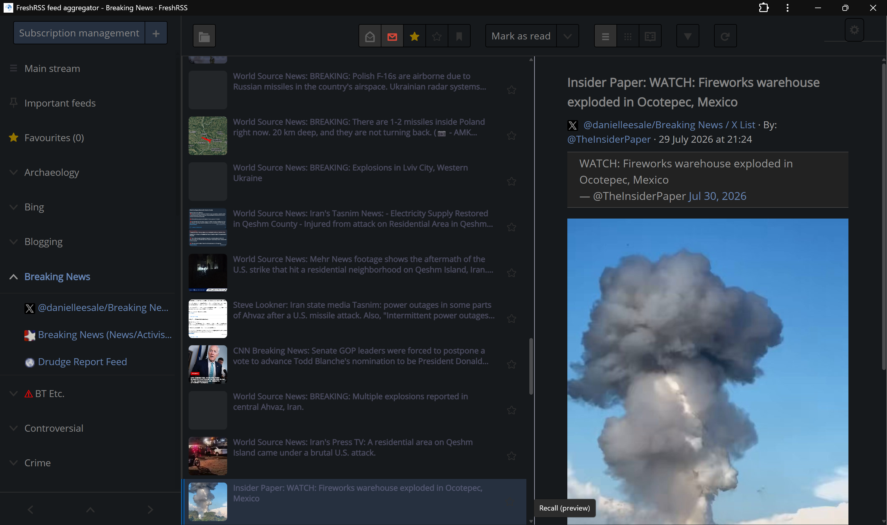
I've finally got FreshRSS looking somewhat pleasant after a long stretch of not being happy with any of its default themes. I don't know what it is about them — a lot of people say they're just ugly. I'm not sure I agree, but there's definitely something going on that has always had me thinking, these could be better.
And it wouldn't take much.
What I've arrived at is a combination of settings, theme enhancement and plug‑in, just enough to make things easier on the eyes. So, go ahead and apply it to your own instances, and let me know what you think.
And by all means, submit your own improvements of themes. If you think you can do better, well, let's see it.
Theme: Dark Content Width: Narrow Website: None Thumbnail: None Article Icons: Top star selected only
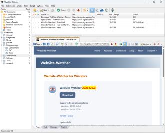 I've ditched my RSS reader for WebSite-Watcher from Aignesberger Software. It's not the first time. I've used the program on-and-off for years. It just seems to me it's better to have something to monitor anything with than be restricted to the usual limited RSS reader offerings.